
Data Crunching
Information design can be excellent or very sterile. It can quickly take information and put an image that resembles the topic but fails to tell a story. Exceptional information design utilizes a visual that is relatable, and quickly educates us as to what the “story” is behind the information design being represented. For this example, the designer took the information, and made a visual that clearly showcased the reality of women in power. Using the idea of a face being broken up into different races and demographics, shows how each female leader’s power is in comparison to the others. It also paints a picture of ethnicity as we see side-by-side the different races that are represented across the globe.
Using the squares as a grid also provides us with more information for how many people are influenced by these leaders, as each square shows us that one million people are governed under this leader. The final element that I feel really ties the infographic together is the pink and blue, colors, showing the percentage of women in power (5%) to the percentage of men in power (95%). Both colors are powerful to the genders that they represent.
The difference is striking, especially when placed above the percentage of females and males in the overall population, 50% female, to 50% male. It quickly and effectively educates us on the issue. The only criticism that I have for this infographic is that it shows the issue, but it fails to prompt the audience with a solution or a way to help alleviate this problem. Perhaps a link to an organization that is making efforts towards reversing the percentage? Anything to help the audience understand that this is not hopeless, and that there can be a call to action, rather than just a regurgitation of data done very well.

Real life example:
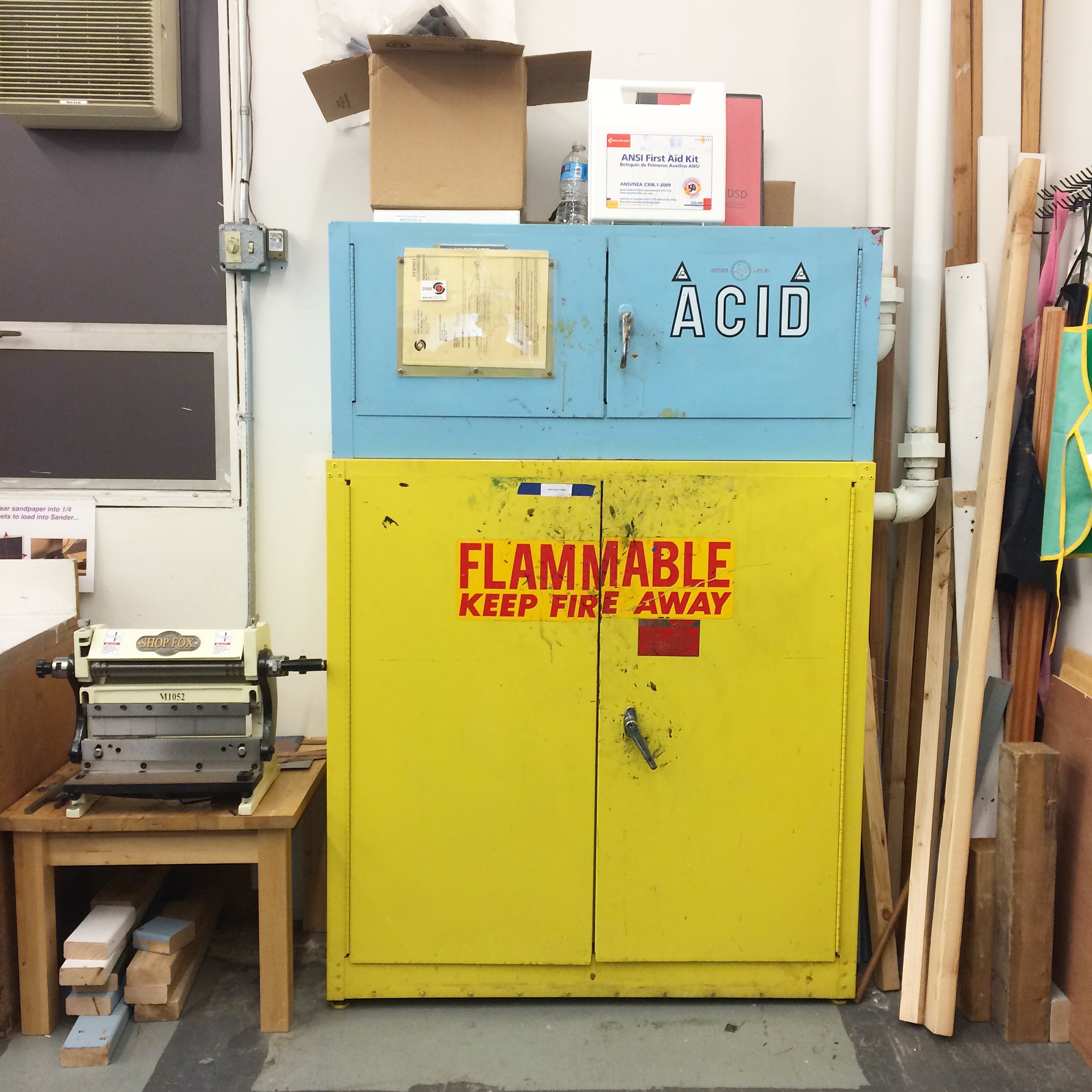
For a real-life example of information design, I found in the Art Center, printmaking room, an excellent example of how color, type, and scale can be such valuable attributes to information design. The information in this scenario is more simple, there are chemicals. These chemicals can be bad for you. These chemicals are also flammable, so keep fire away. It is as simple as type can be, yet says a lot to the individual. That in itself is powerful. The bright and shocking colors also bring awareness to the importance of the contents in the cabinet. The bright red onto of the shocking yellow really contrast to create an eye-grabbing experience. Simple yet bold type are easy to read and stand-out among the color.
Overall, simple and effective is the way to go when you're crunching the numbers and outputting data.