
A Case for the Serif
It’s important to remember the serif. The feet, the bowl, the ear of the “g” and who could forget, the ligature. A well designed serif is a beautiful thing. It’s tempting to fall into the title of “typo-file” as a designer, but there is a crucial case to be made for the Serif that involves everyone. A careful look around and it’s clear, the sans-serif has taken center stage. This is especially true with the wave of rebrands as companies are chucking their serif left and right and instead choosing a generic sans.

photo courtesy of: 97thfloor
I wanted to take a deeper look to understand the true “why” of this design change, and what it means for the future of the serif.
The sans serif was a direct result of screens. Our screens are a collection of pixels, shown with Red, Green, and Blue light to create these vibrant and buzzing colors that print can never capture. Given the pixel, the serif was an issue. Small details of the Garamond typeface didn’t render well on the first screens. It became hard or even impossible to read. A font needed to be created that used as few pixels as possible. A smoothed our serif, limited to only what the user needed to understand what letter they were looking at. The sans-serif. It makes sense when you think about it.
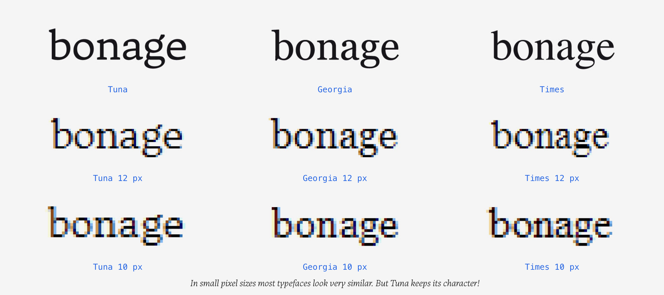
photo courtesy of: Tuna
It’s impossible to truly capture the elegant lines of Didot italic as a rasterized typeface. Georgia is clunky, and times new Roman is already considered blue collar for web. It’s still the default HTML, we’ve all seen it. My prediction is that a sans serif will become the default HTML within the next five years. Perhaps Arial? (If google had it their way, it would be Roboto and I would be down with that!) Sans serifs are becoming the default because not only do people argue that they’re easier to read, they scale better. This is a different argument than branding however as a logo represents the purpose of the company, not the legibility on a screen.
Typography on our screens was rasterized and it wasn’t until vector became available that serifs could be utilized again. Tuna makes an incredible case for legibility so I would encourage you to check it out:
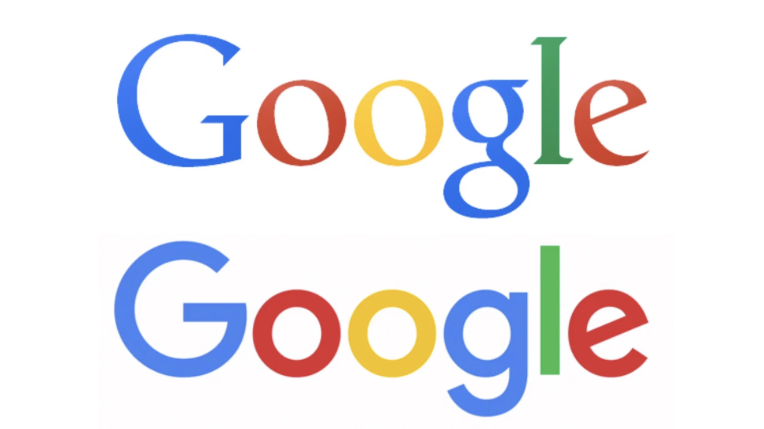
So when did the sans branding shift happen? Perhaps it was when google shifted from its original serif to the geometric sans it still utilizes. A sans serif best resembles tech. It implies a screen or a Saas model and none of the print implications a serif has. Google feels right as a sans. As does Microsoft, Airbnb, Autodesk, etc. Now if NYT, Tiffany and Co. and Rolex all adopted a new serif logo, that would compromise the value that the serif adds. A typeface provides credibility when it is used appropriately.


Images courtesy of BrandNew
Over the past two years, we can begin to see how rebranding with a sans serif has directly removed value from the brand. It changes not only the appearance but the credibility it once has. In a pinch, a sans seems to be a solution. It’s clean, modern, and easy-to-read. I urge designers to challenge the laziness of accepting a sans serif and considering how a more customized typeface or an original serif can better capture the purpose of the company it represents. The issue is not that the sans serif is a bad option, it just shouldn’t be considered the only option moving forward. Branding has become watered-down and predicable and will continue to be if we only reach for the “safe” sans serif.
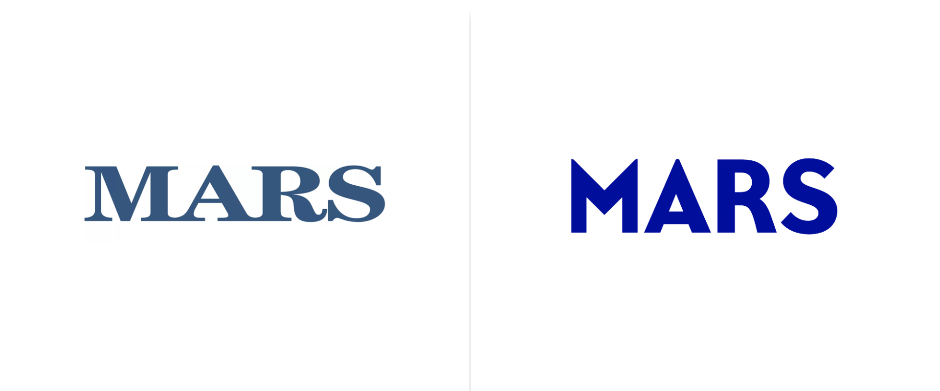
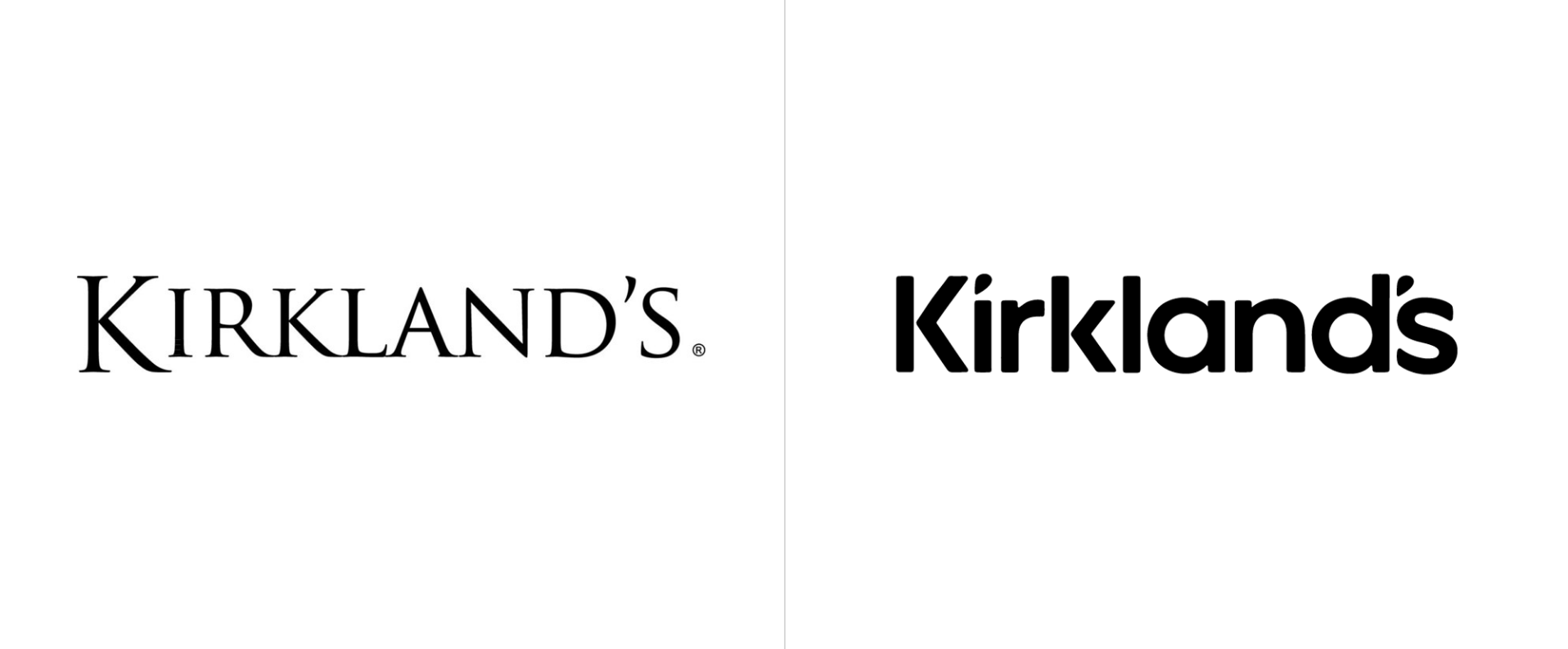
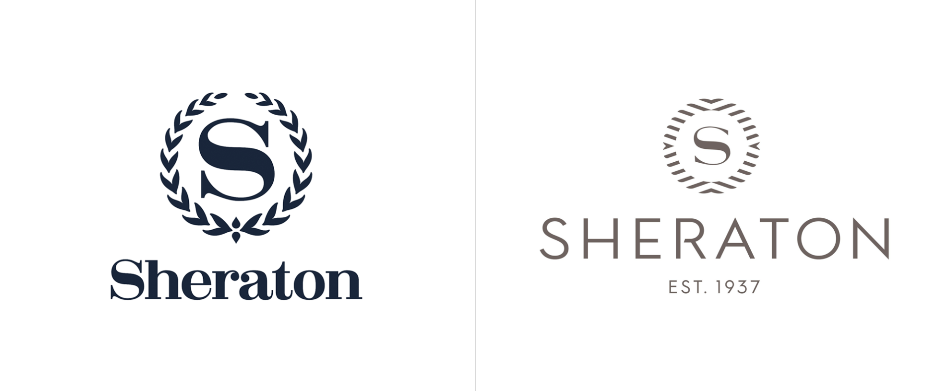
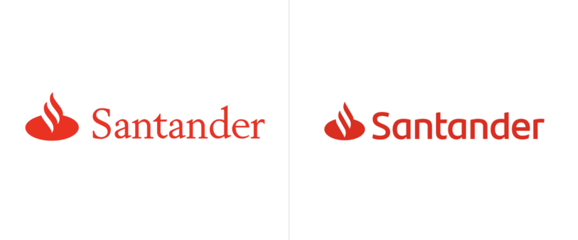
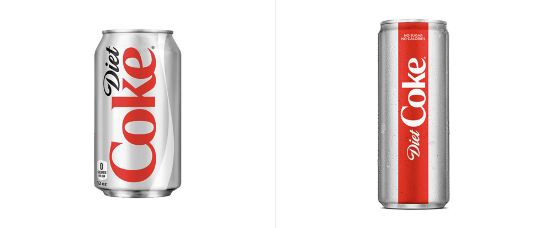
Above we can see some examples of the serif shift. I focused on the re-brands that I though compromised the original design by deciding to utilize a serif. All of these companies have one common thread, longevity. They are established brands that have a more humanized approach. They are trusted banks, places to stay when you’re traveling, iconic candy or soda companies, or even a library. A serif has a more editorial feel and therefore, if the logo is representing a piece of editorial or a library, a serif should never be considered. Imagine if the New York Times shifted to a serif. It’s the wrong turn, Library of Congress!

Image courtesy of: graphic design stack exchange
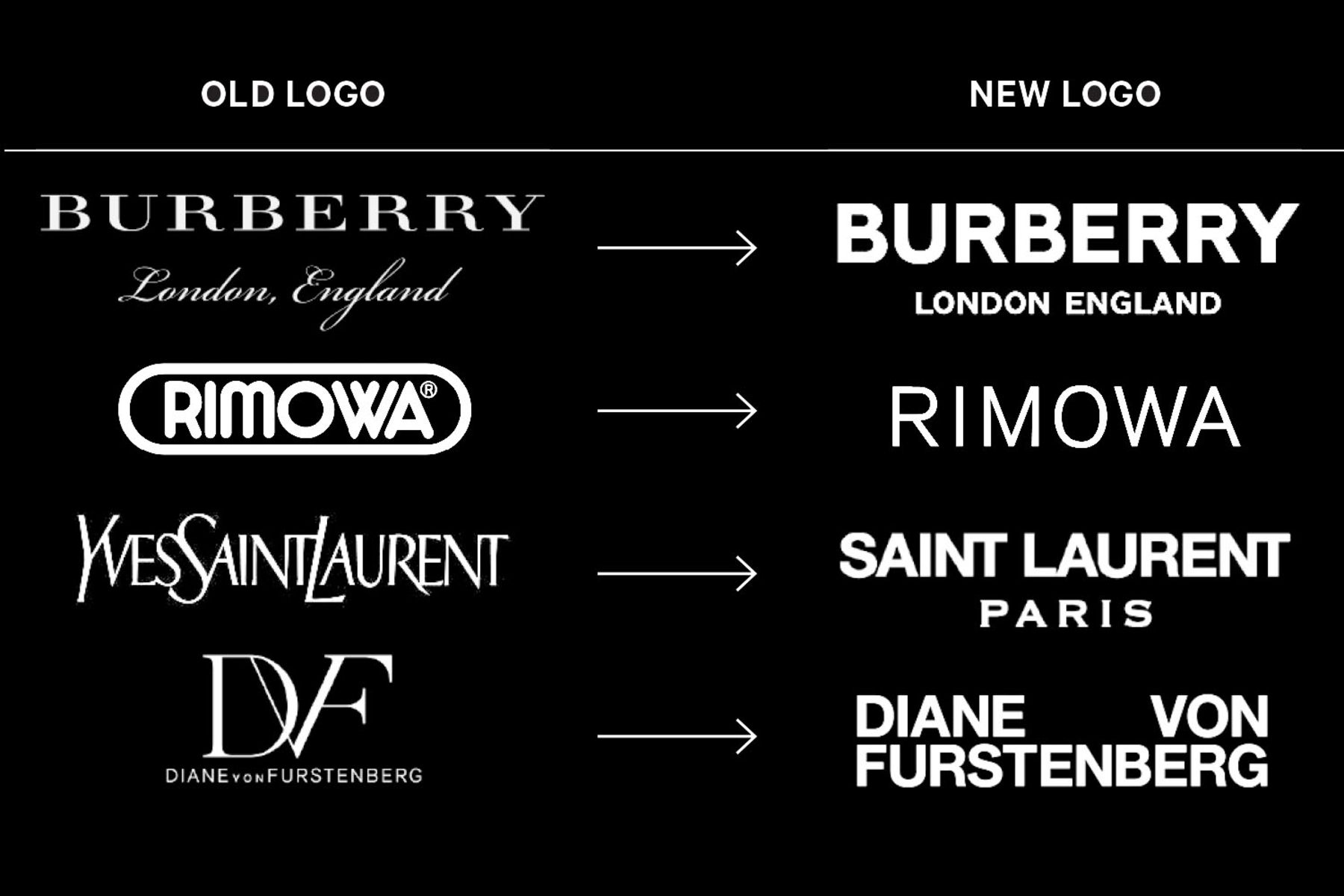
Image courtesy of Bloomberg
The argument that a serif is hard to read on screen in present times is defunct. With the emergence of the retina and HD screens produced at a much more affordable rate, there is not longer a legibility issue. With vector capabilities and less pixels being relied on, a serif can be right there with the sans in screen and render beautifully. In fact, a serif is considered more legible. When we begin to read, books are almost exclusively printed with a serif typeface. We’ve essentially been raised on the serif and it should still have it’s appropriate place in the digital world and especially the branding world.
Important references:
Design shack: Web Design Debate: Do I Really Need to Use Sans Serif Fonts?
Creativebloq: Are brands saying sayonara to serifs?