
The Stripe Effect
Have you seen the Stripe site? It's been passed around quite frequently in the design world. A designer might argue that it's the pinnacle website design for tech. It's clean, unique, meticulously designed for all responsive layouts, and overall sets a higher standard for similar tech companies. It seems to have caused a ripple effect. It's perhaps impossible to know who first curated the "Stripe" template, but since its emergence other companies have followed suite. Some almost looking identical.
This is important to note because designers are beginning to rip into the Stripe template and challenge its stamina. Does it have the legs? Will this stile carry on until another dethrones it? To give more of a perspective, I have screenshots of some of the similar or almost identical sites that follow the Stripe template.

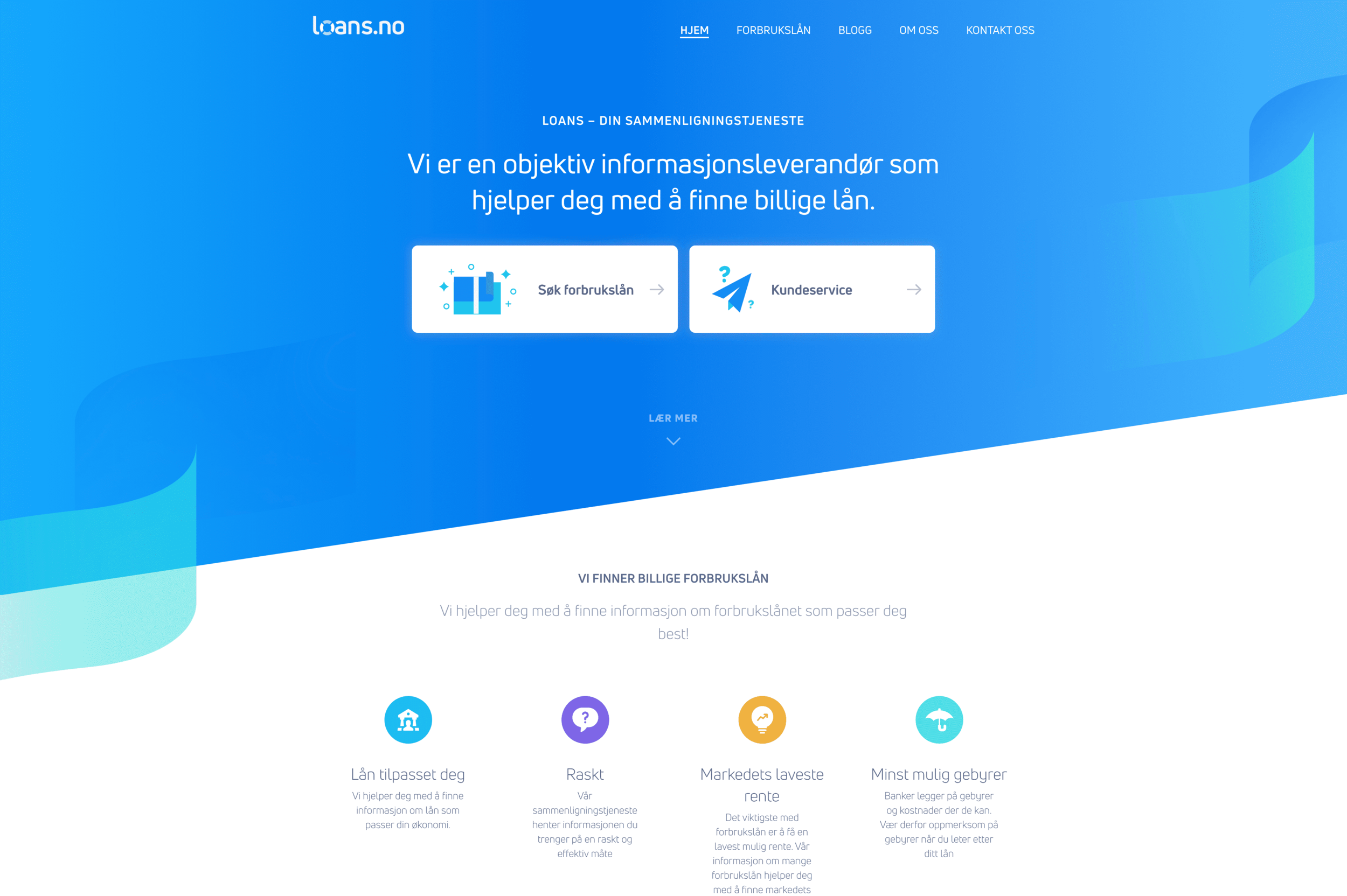
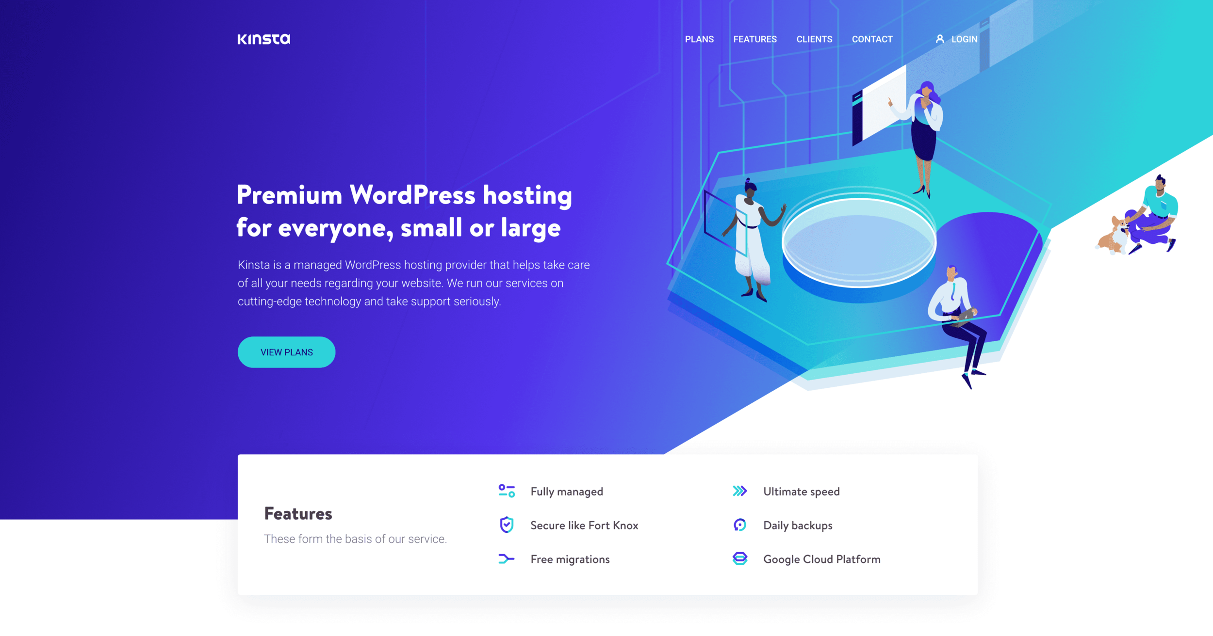
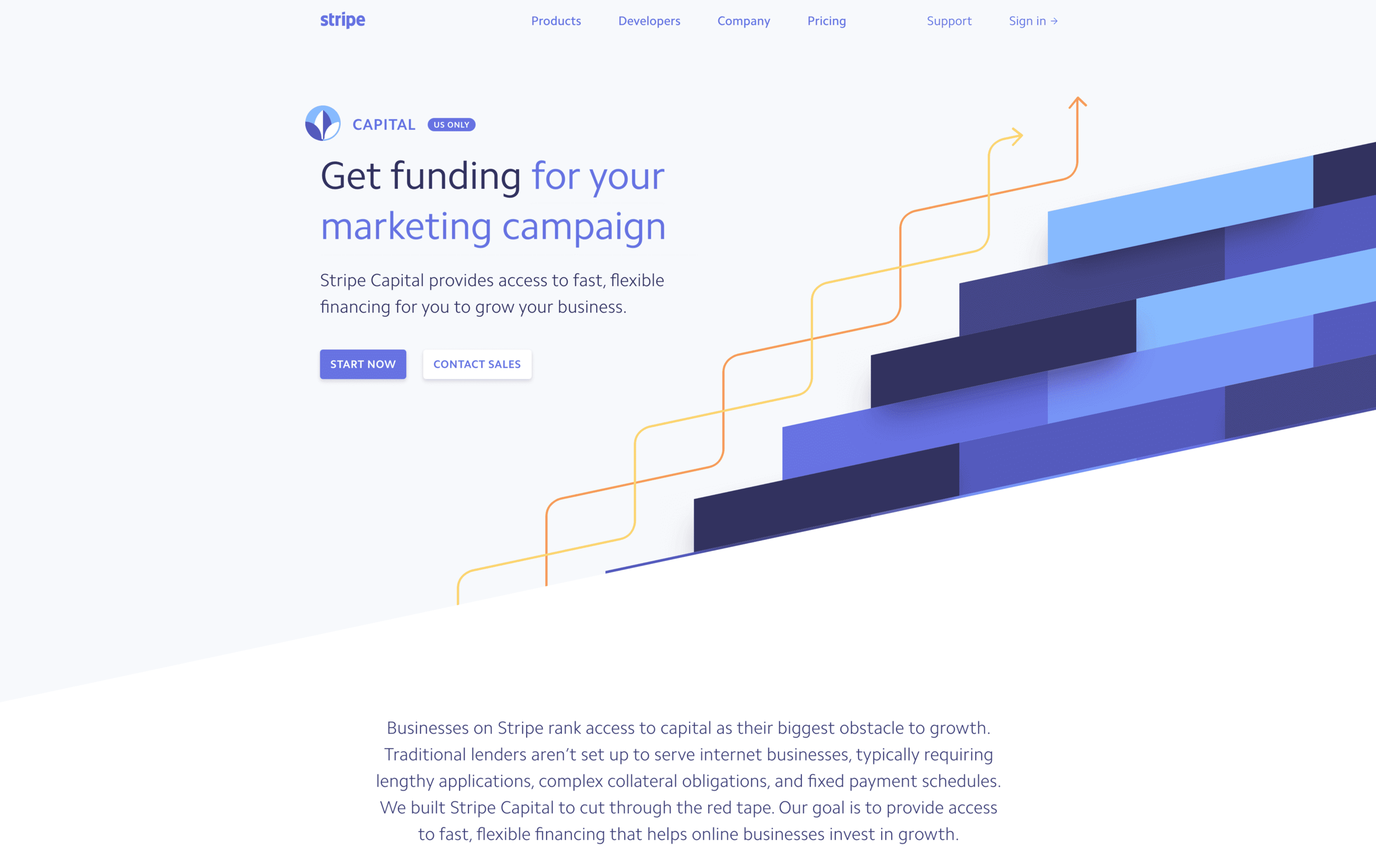
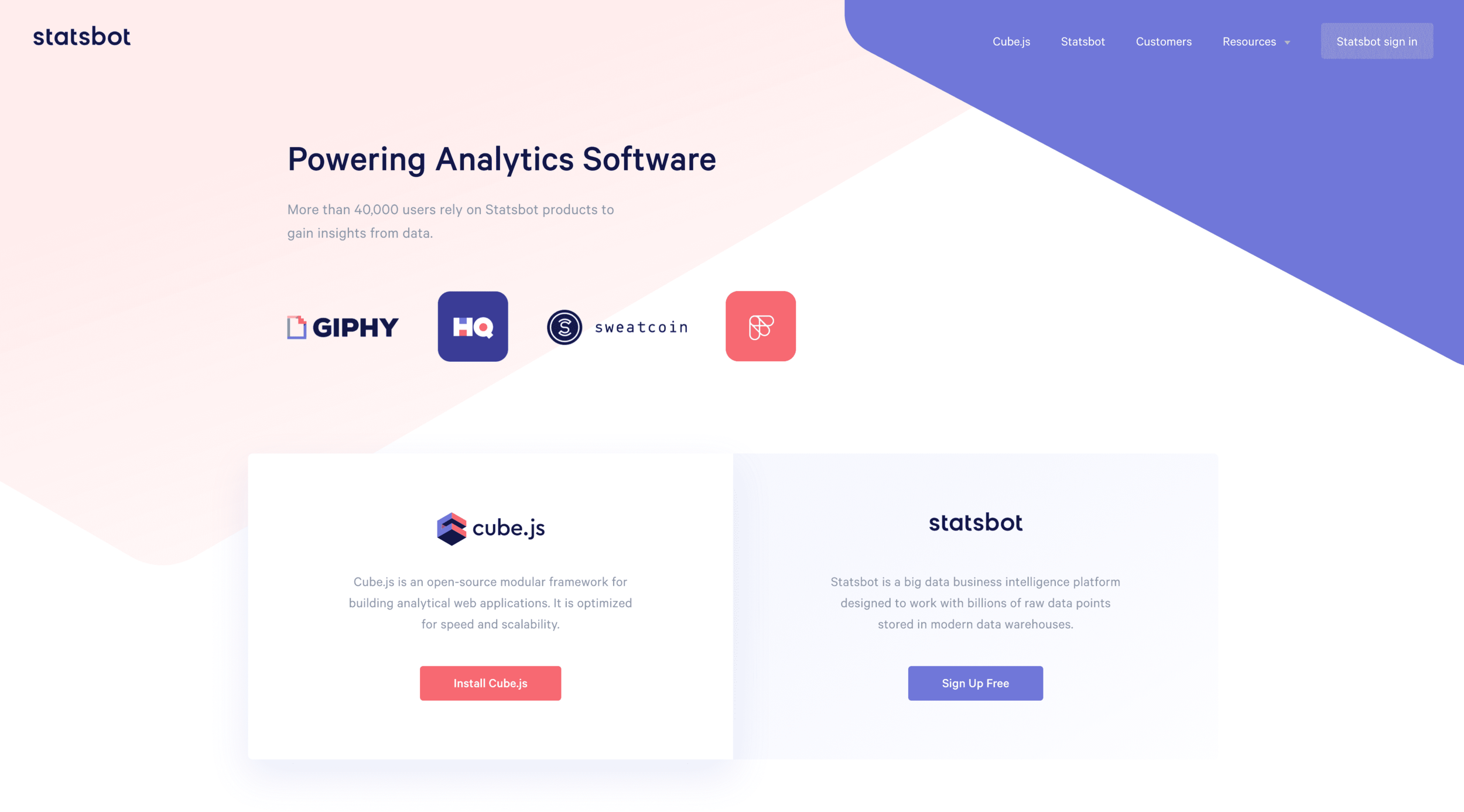
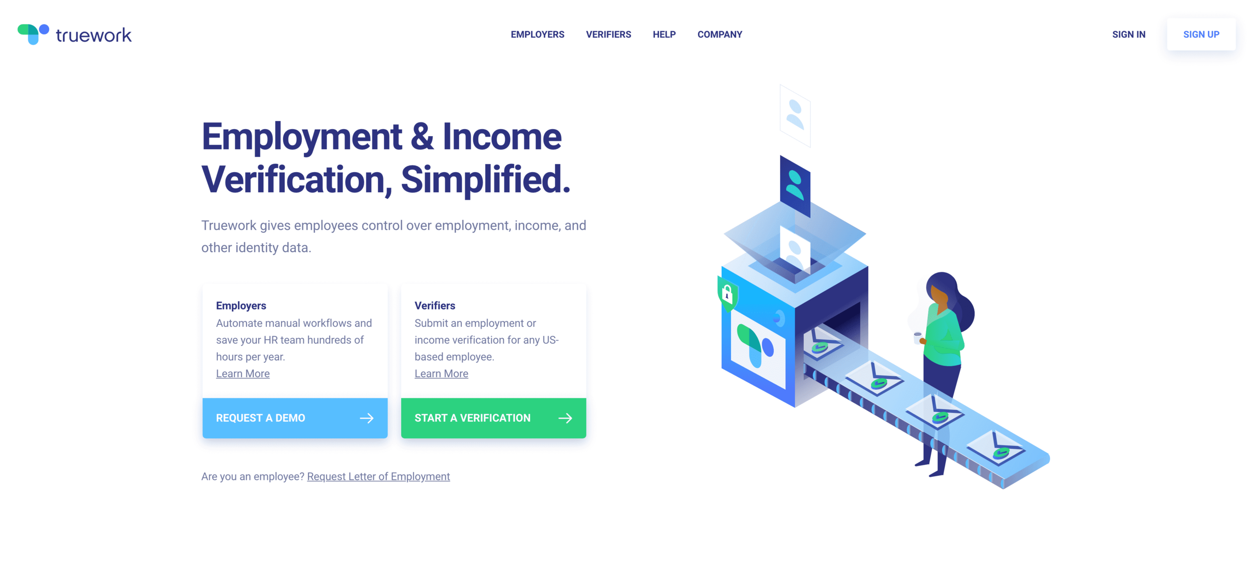
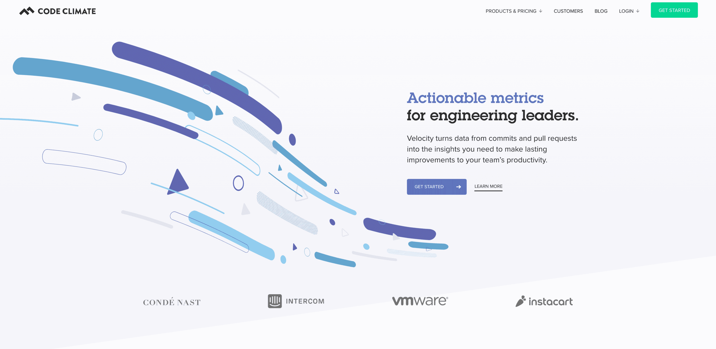
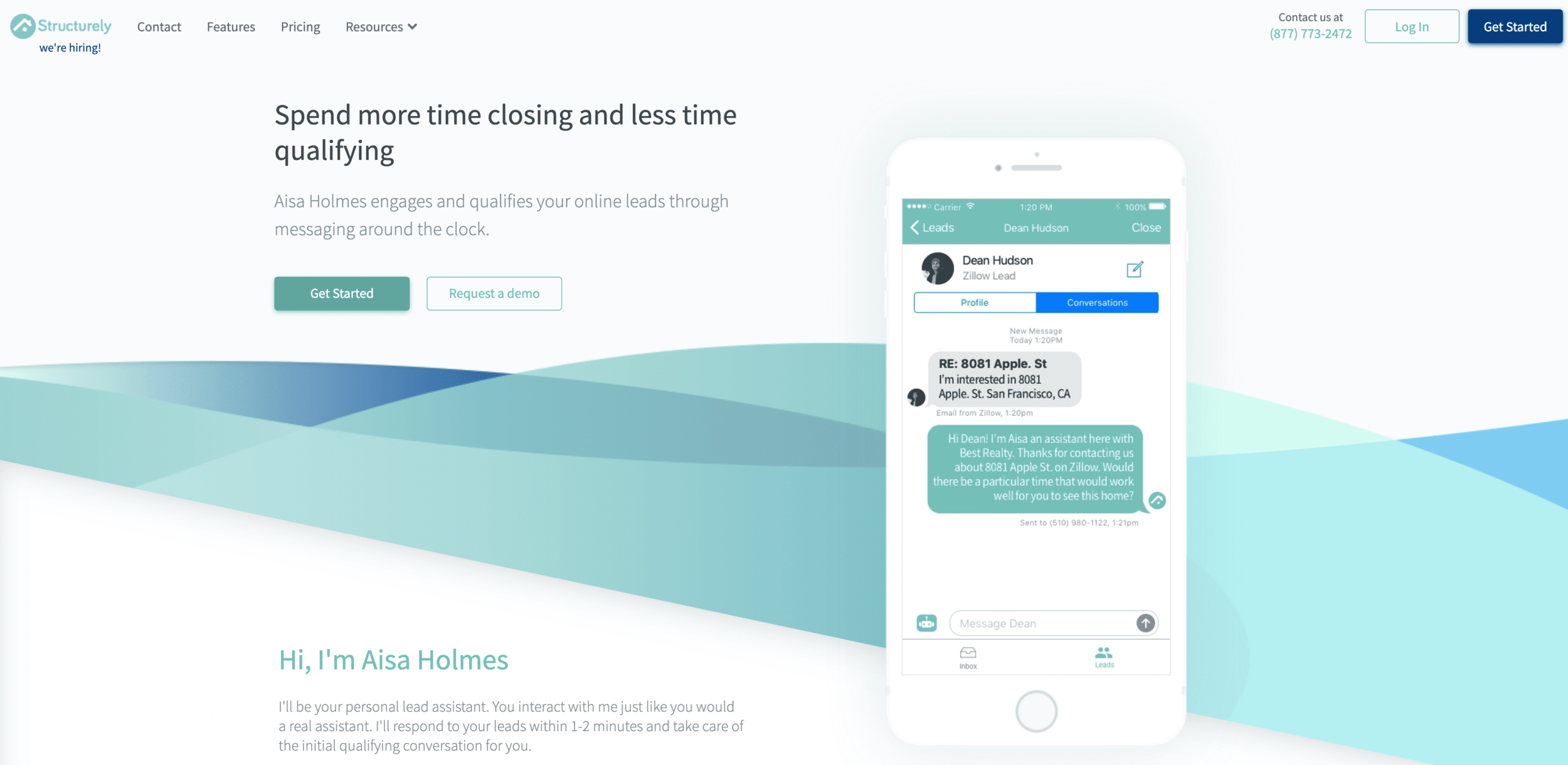
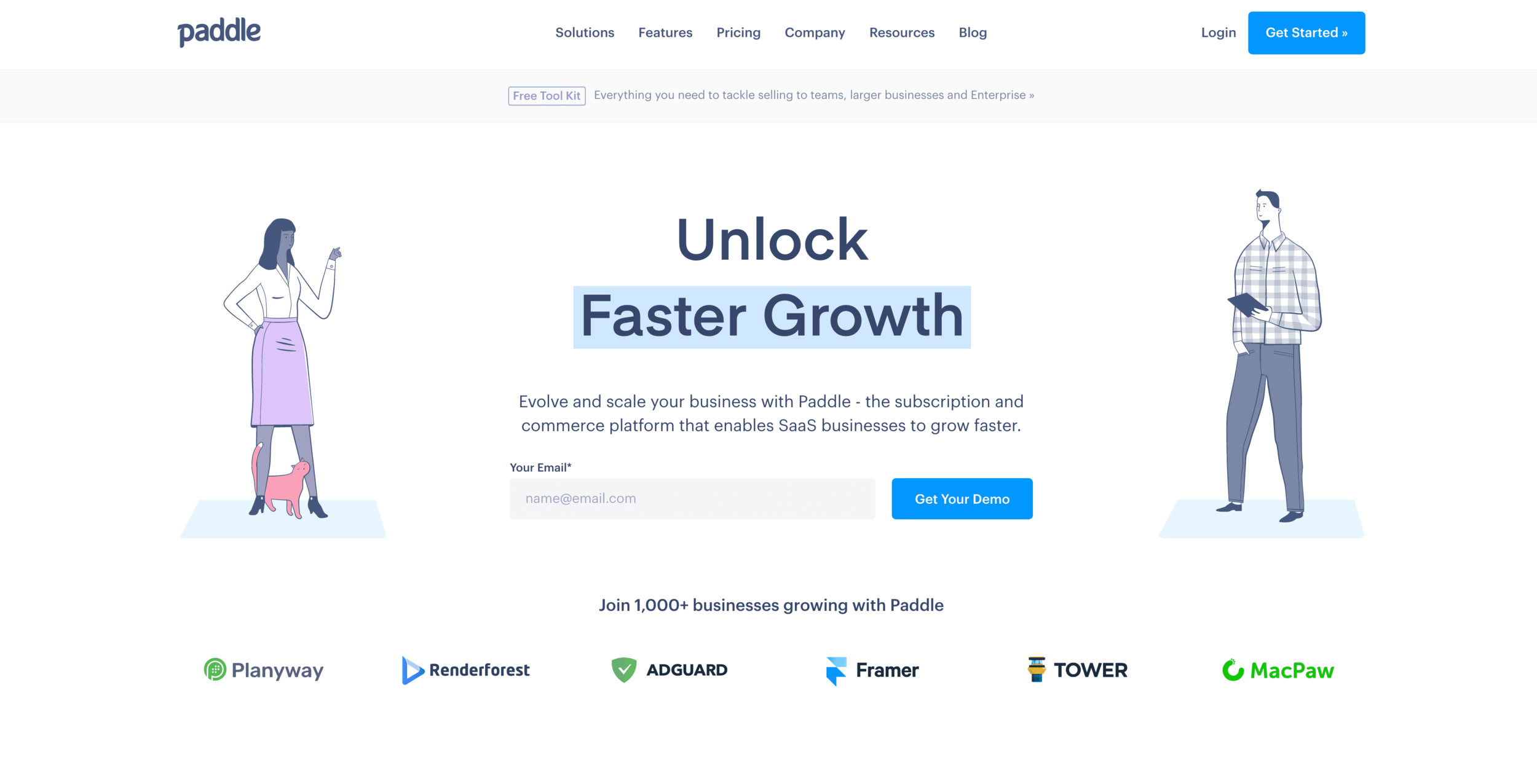
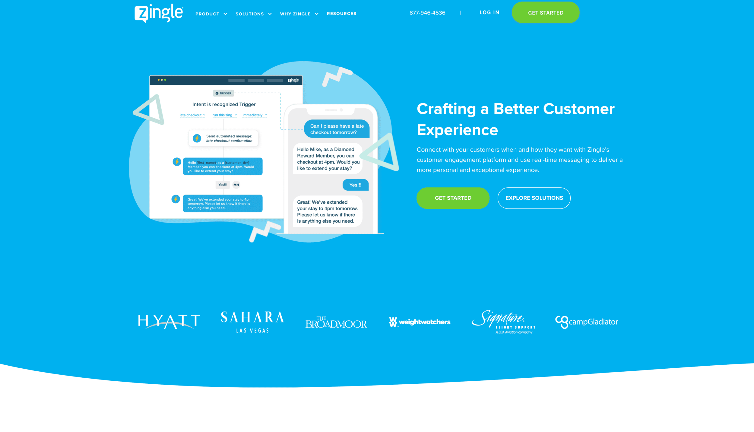

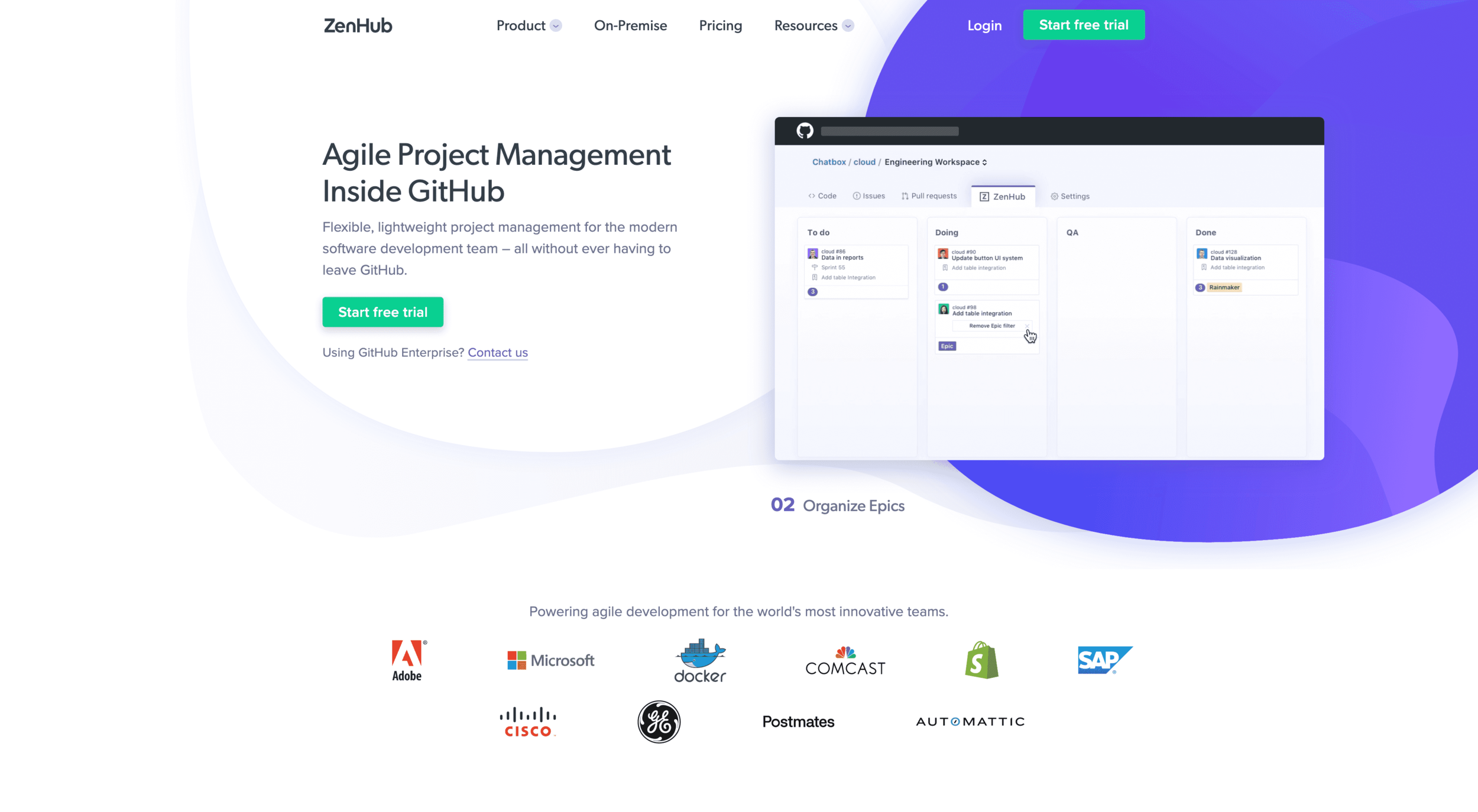

See what I mean? There's a pattern here. So what constitutes a Stripe template?
Stripe template:
- Bright pastel colors
- Brightness of the color implies hierarchy
- Sans-serif everything
- Clear call to actions
- Flat illustrations
- Use of subtle gradients for depth
- SVG animated icons
- Color change on hover
- Runkit embed (use of interactive code)
- Copy is left aligned
- Copy is centered
- Copy is right aligned
- Multiple colors all in the same hue
- Muted colors used to break up the page
- Custom icons
- Large dropdown with icon illustrations
- Greyscale hover
- Subtle CSS animations to imply the UX
- Diagonal lines and blocks of color that break the grid
- Muted greys to reinforce sections

Now that the style is defined, is it so wrong? If designers are gravitating towards this style again and again, it can't be too bad? To take a closer look, I've created (an objective) Pro and Con list to really breakdown what is working, and what's a trend that will fizzle out.
Pro:
Overall, from an unbiased perspective, this website is well designed. It's user-friendly, clean, doesn't make me think too hard, but still includes design elements to keep me engaged.
- Clean
- Friendly
- Successful use of animations
- Good sense of hierarchy
- Excellent responsive design (kudos to the dev team here)
- Quickly educates
Con:
After this study, it seems that the negative aspect for Stripe is the bias of the trend. The issues with the site lie mostly in the choice of color, deliberation to break the grid, and the very abstract icons on the dropdown.
- Some color combinations with text are hard to read
- The bouncing between left, right, and centered text is distracting and feels unorganized
- The diagonal lines are hard to replicate in a digital system
- A lot of text to read
- Icon system seems too abstract to grow if other designers would need to add to the system
So in conclusion, their site is really clean and communicates very effectively what type of product they are. Their design decisions seem, for the most part, very deliberate and work towards a system. Establishing that Stripe is successful, the unfortunate bend to this are the copy-cats. The Stripe template, I believe can be applied to other similar companies and work successfully. The issue is the lack of originality and this new expectation that all similar companies should present themselves the same way digitally. The main issue here, is the increased difficulty to distinguish one site from the other. The same argument can be said for the obnoxious custom illustration sites. I'll be honest, I really liked the trend initially. It brought a human element to a very-tech focused idea and provided ownership. Again, the issue here was that every tech company was and still is doing it.
So what's the issue? There will always be trends. Parallax has finally calmed down. Duotone images still make an appearance. The rotating circle of text is emerging wherever possible. There are a lot of theories that begin to surface here, but my take is just that web is still so new. We are finally developing the possibilities of more on web and it continues to be exciting. Fortunately for us designers, developers have created incredible tools like bootstraps and flexbox to make web design far more organized and grid-like. CSS is extremely powerful now, and animations are far more tasteful. (bye bye flash...kinda). We are still learning however. We are still looking for the "webmaster." Yes, we had Brockmann, Ruder, Tschichold, Eames, and still have Vignelli, and countless other incredible designers who have, and continue to inspire us. They paved the way for design but that design lived in print. Most left us before the design world as they knew it became the digital mecca that it is today. So until we have the modern day web designers that will go down in history, we will continue to find and encourage website trends.
Some of Stripe's template components will live on, and some will fall away. The key is to focus on the user and to consider the design thinking behind the web design. Colors, fonts, icons, and animations are the variable. The rest is a solid foundation to work from. So when your boss whispers into your ear next time and inevitable utters, "make it Stripe" ask yourself, what from Stripe works and what is just a trend?