
Capriza
What
Capriza is a mobile and desktop approvals platform that streamlines the approval process that can often get bottlenecked and difficult to manage.
Problem
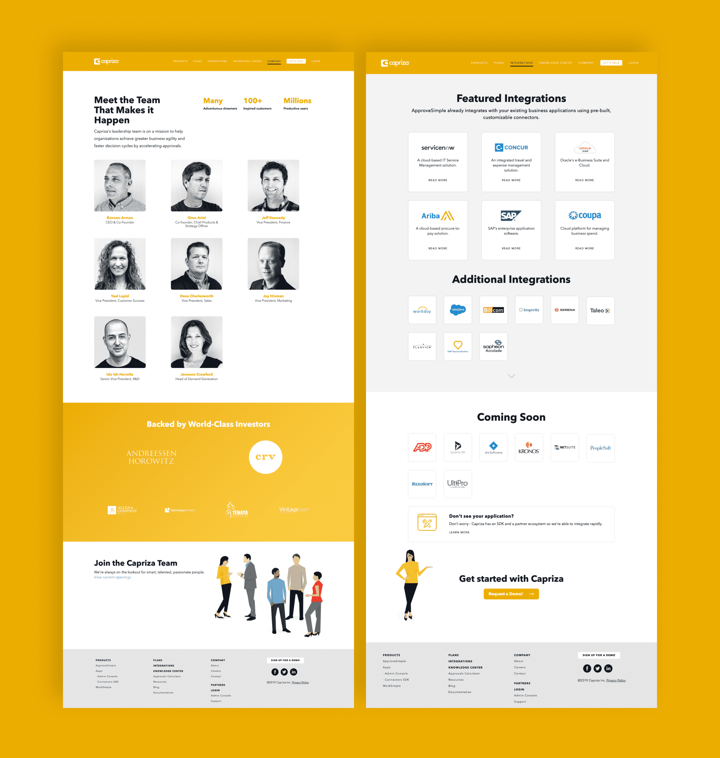
Capriza had an existing website that worked to capture all of the information about Capriza but needed to be refined so that information could be both paired-down and presented in a much cleaner fashion. Gilmour Craves worked with the Capriza team to understand exactly what their goals were in the process of a website redesign, and how this site could eventually grow and expand. The other challenge with this project is that they wanted a quick turnaround as they were desperate to get the website refresh up and running as it was due time.
Process
In discussion with the Capriza team, the three biggest items to communicate were:
What is Capriza and how can we share this in a tangible and visual design?
What is their branding and how do we permanently establish this decision?
How can we relate to the wider audience and create more engagement?
Project Scope
Art Direction
Asset Management
Brand Strategy
Brand System
Custom Illustrations
E-commerce
Front End Development
Industry Research
Photography
UX + Visual Design
The main way to solve the question of how to visualize Capriza was to show the problem without Capriza and then, in turn, reveal the solution. This came to fruition when I began considering visual metaphors that could best represent how Capriza can improve your workflow. Initially, the metaphor was a complicated cityscape with hazardous roads, roadblocks, traffic obstructions, etc. The solution was to show a quickly moving overpass. This animation proved interesting and visually successful, though it was just too complicated for the user to understand instantly. A messy desk is something that nearly everyone can relate to and experience daily. It also allowed us to show how your desk could look if you don’t have an organization system like Capriza to do the mundane tasks for you. To visualize this best, we stuck to a simple flat illustration style that would be easy to replicate throughout the site, and also quick to understand visually. The interactive slider on the homepage just adds to the excitement as users can engage and reveal the “before” and “after” of Capriza.

Before Capriza

After Capriza
2. Capriza has always been a bright yellow color and though yellow can be tricky to work with, it made sense to put a stake in the bold to really own the color and make the brand evident. We made sure to own a typeface too, and selected Avenir Next as it mimics the word mark of the current logo, but presents a legible web font for both header and body copy. Lastly, carrying out these colors, the illustration style, and typeface rounded out the Capriza brand and made for a style that could be expanded on easily as Capriza would ideally grow.

3. In the process of creating the Capriza illustration style, the persona “Capriza Lisa” was born. The idea was to create an avatar that could resemble Capriza and then explain to users about the product and ways to engage. She would be helpful, informative, and personable. Lisa adds personality to the Capriza brand while still remaining professional and to-the-point.