

HemaCare
What
HemaCare is the leading medical company in providing cellular matter for biomedical research. They specialize in collecting, preparing, storing, shipping, and distributing their products around the world. In short—they are an e-commerce site for doctors and third-party medical buyers.
Problem
Their existing site worked to fill orders and distribute but the layout lacked a thoughtful user experience and compelling imagery.
Process
When Gilmour Craves and the HemaCare team sat down together to assess the goal for the HemaCare site, it became clear that they wanted their look and feel cleaned up, simplified, but also have a unique personality. When I began the wire-framing stage, I was careful to consider exactly what information needed to be there, and what content was in the way of the HemaCare message and goal.
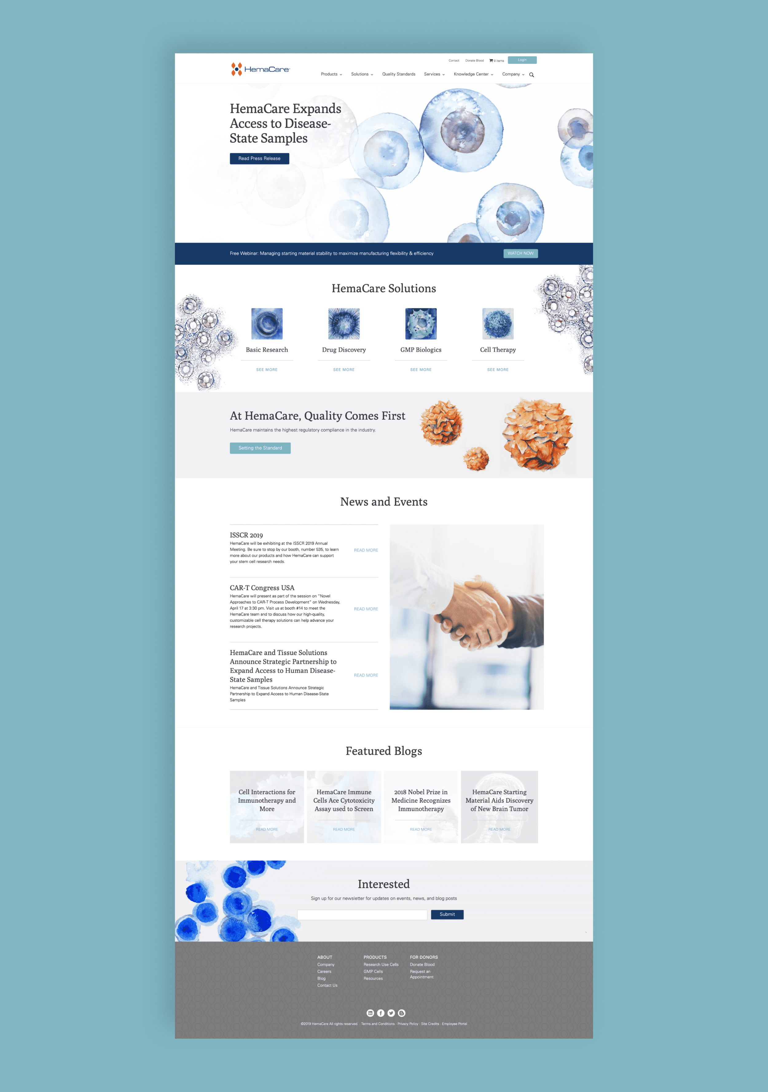
When the wireframe was approved, the time came to begin the design phase. The first concept was to utilize lifestyle photography that showed the positive and warmer side of HemaCare. With any photography challenge, it quickly felt generic and difficult to manage such a specific look. The second idea was a far more bold and modern approach—black background, bright and popping imagery of cells and molecular structures, and pops of gradients. The final direction was when I came across the incredible illustrator Kaitlin Walsh of Lyon Road Art. Her abstract watercolors perfectly captured the beauty of biology. It softened a usually rather strange subject and made the imagery instantly intriguing. Once we shared all three directions with the HemaCare team, the response was unanimous, the Lyon Road direction was their favorite.
Project Scope
Art Direction
Asset Management
Brand Strategy
Brand System
Custom Illustrations
E-commerce
Front End Development
Industry Research
Photography
UX + Visual Design
Solution
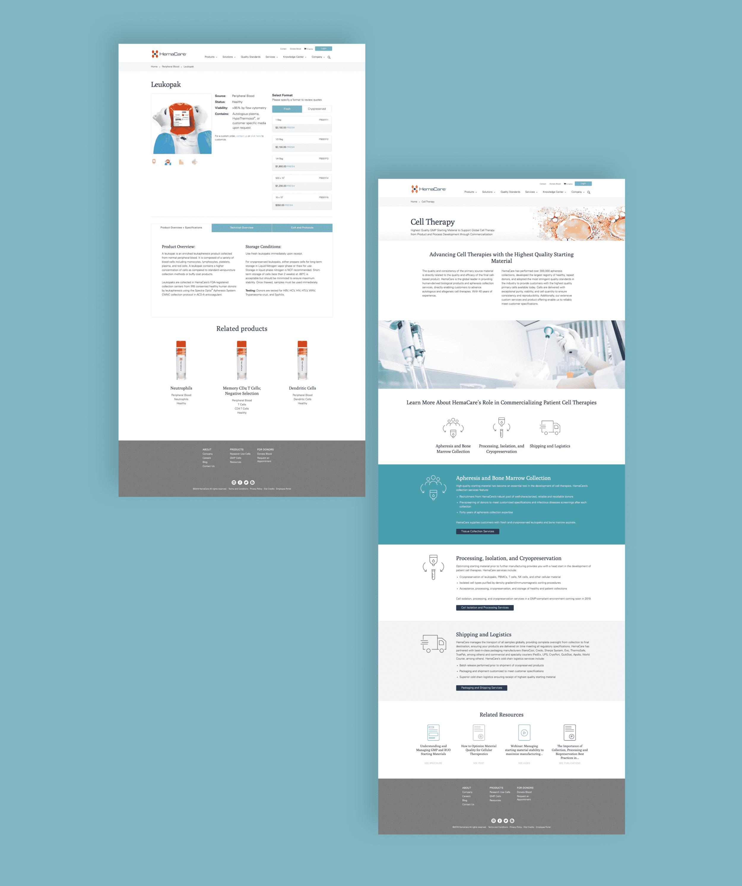
Once the design idea was selected, it was time to consider the user experience and nail down the e-commerce. I worked to ensure that the site architecture made sense as the user navigated through the various products while presenting the products in a way that made it easy to understand what packaging, and preservation style they would receive. One of the unique challenges for this site’s UX/UI was on the product level page. When the user selects a product, they are directed to choose between “fresh” or “cryopreserved.” In layman's terms, fresh or frozen. You can see an example here: Mobilized Leukopak. The big reason for this is to ensure that the product will arrive exactly how the doctor or medical specialist will need it.

The site came together really nicely as the entire HemaCare team was extremely helpful in giving guidance and ensuring that we understood exactly what it was that each page needed. From custom icons to specific imagery, we made sure every detail was scientifically accurate and made sense.
Here is an example to the left of some of the blood cells that Kaitlin painted for the HemaCare site. There are twelve custom water color illustrations that Kaitlin made for the site and the texture and beautiful detail really complete the look for the website and experience.
The last major piece for the site, was updated and clean e-commerce images that gave the user a better sense of the packaging and product that they would inquire about. You can see an example below of one of their hero product shots.