


ACME
What
ACME is a venture capital firm known for investing in iconic founders who disrupt the status quo and lead within their respective categories.
Problem
ACME Capital needed a website and an entirely new look for its brand. The company changed names so it was important for them to present themselves in a new and memorable way. The ACME team worked with Sunny and Scott of Sunny in the Park for a new branding system and design direction. Gilmour Craves collaborated with Sunny in the Park to bring Acme’s new brand identity to life. ACME came to us with the mission to launch a new website and match their vision for investment and innovation.
Project Scope
User experience
UX / UI
Responsive web design
Customer relationship management
SEO optimization
Art direction
Asset management
Designer collaboration
Process
This opportunity was unique because I got to collaborate with talented designers and get helpful feedback for their vision of the new site. We worked in the Adobe XD files that were shared with us from Sunny and Scott to begin to look at the layout for the site. The challenge with the design was that ACME wanted a single-page site so a lot of scrolling was involved. The other feature to be mindful of was the concept of “alter-egos.” ACME wanted to include a small “easter egg” on each employee to be clickable to reveal their alter ego bio and photography. The goal was to capture the personality that ACME wants to represent. Once we had the wishlist items down, it was time to collect all of the assets and manage them for the site. This meant optimizing and carefully determining the aspect ratio of each item. The site design was very image-heavy with each portfolio and team section so it was crucial that it looked correct and was beautifully responsive.
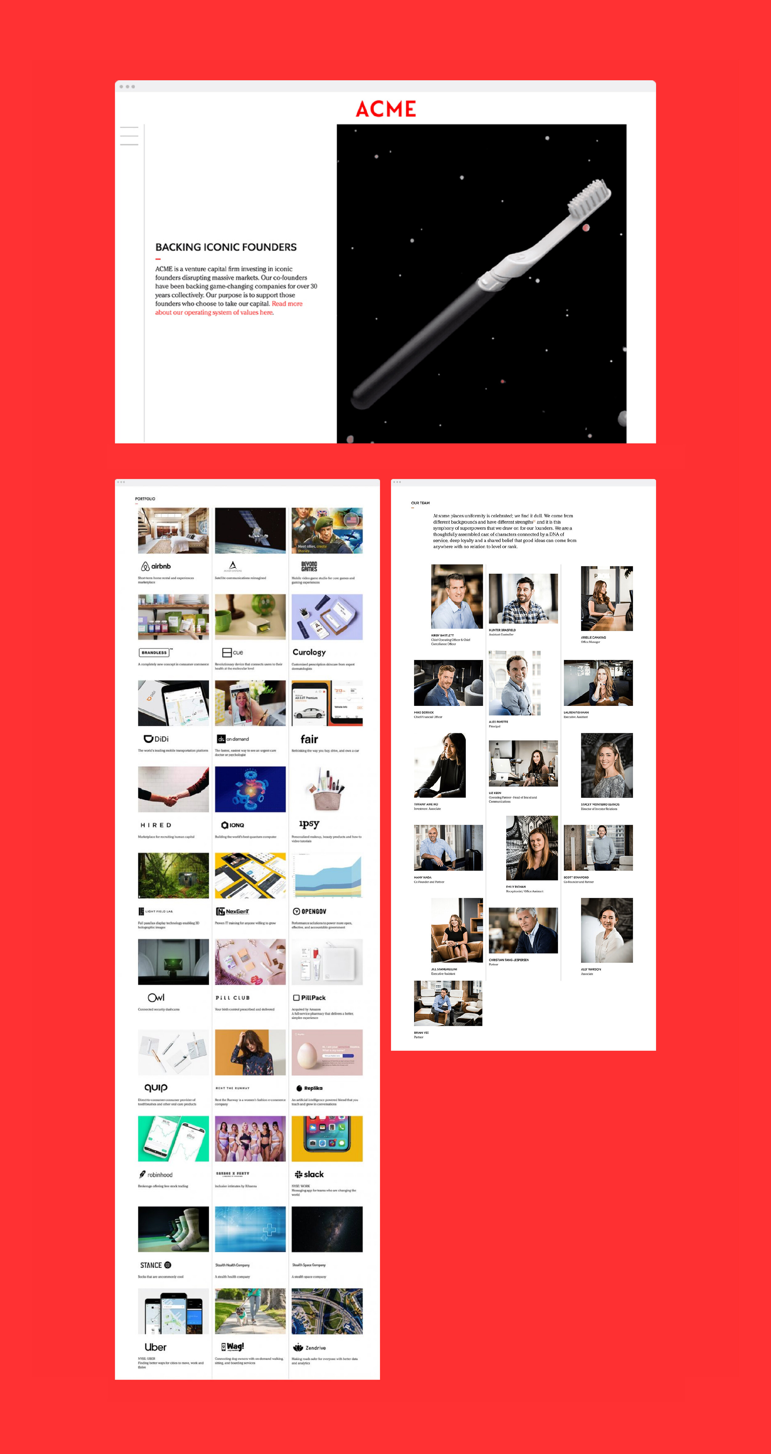
Taking the existing content and layout, for the redesign we wanted to focus first on the long scrolling page. To solve for any usability issue on navigating through the site, we included a navigation option so the user could navigate to a certain location on the page. This is unique to anchor linking because the site section on the long-scrolling page was broken out into separate pages. This helps with 1. Usability 2. SEO (it gives Google more pages to crawl) 3. Marketing as the ACME team can send the user to one specific page. The other addition to this site was to look at the “alter-egos.” The ACME team wanted to add in an “easter egg” so the user could dig deeper on the profile pages to find the user’s alter ego. We included a small, animated red dot to be clickable and reveal the fun side of each ACME employee. It was intended to be subtle but still noticeable when a first-time user engages with the team page. We had to solve mostly for the layout of the site as there were a lot of assets to consider on the build-out and also a lot of input from the ACME team. Often our conversations were back and forth, but working together, we were able to successfully capture what each team member intended and desired for their new site.

Solution
The result is a uniquely branded venture capital website that puts the emphasis on the ever-growing ACME portfolio–founders, their stories, and what they’ve built. Showcasing the ACME team in a unique way by including their “alter-egos” surfaces ACME’s values and corporate culture. Since the website launch, ACME has quickly established itself as a thought-leader in the VC space.
