
Gilmour Craves
What
Gilmour Craves is a strategic design firm built on a simple philosophy: respond to our clients’ needs through insight and thoughtful design.
Problem
I had the absolute privilege to redesign Gilmour Crave’s website portfolio. I was the UX/UI designer at Gilmour Craves from 2018 – 2021 and the previous site had a lot of great content and solid “bones” to work from. The issue was that the site had buried content and at times, too much information. Overall, the look and feel needed to be refreshed for a clean, updated, site. In addition to the site redesign, new projects had been completed so we wanted to refresh the old, and include the new.
Process
With the existing site in mind, we set our goal right away to be a greater competitor in the SF Design Agency market. We wanted to consider who else what out there, but namely what sets GC apart. Through research and consistent discussions, we collaborated on what we wanted the site to have in addition to addressing what was missing. New clients and projects had been completed since the last rev, so we wanted to be sure to include this. Once all of this was established, the process became, wireframing, front-end development using Figma, back-and-forth reviewing, approval, and then finally development. A big part was asset creation and management as we wanted to include refresh imagery and new gifs on the site.
Project Scope
Art Direction
Asset Management
Brand Strategy
Copywriting
Front End Development
Industry Research
UX + Visual Design
Wireframing
Solution
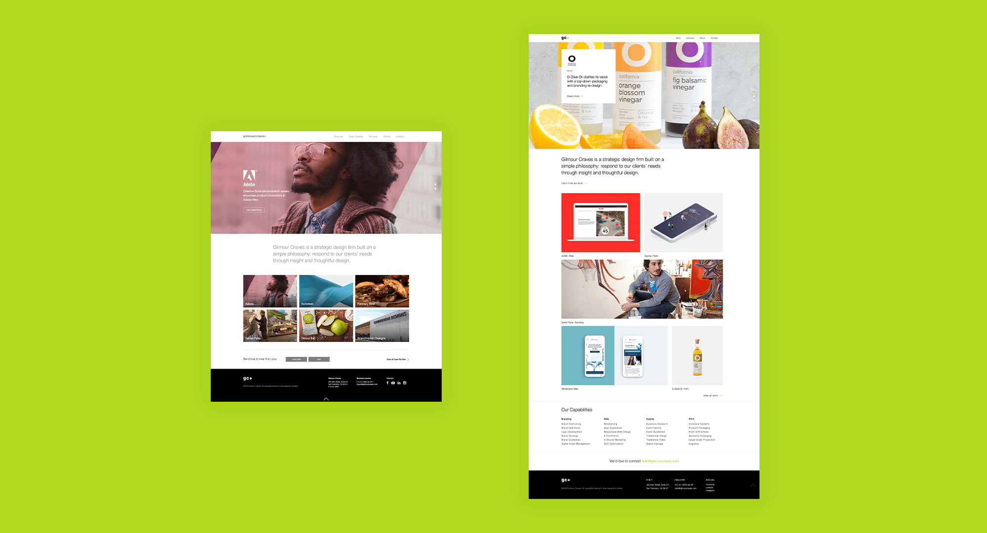
Taking the existing content and layout, for the redesign we wanted to focus first on language. For first time users, we want them to understand right away what philosophy we adhere to as an agency, and also make it very clear what type of page they’re on. The previous version used language in their header that wasn’t as “universal” as it is presently. “Case Studies” does not always connect to “Work.” “Profile” does not always indicate “Services” and “Team.” In short—how do we make it extremely clear what we’re about to show you. The other big update was showing more on the page. The previous site buried some of the content so that you would have to click into the information, and sometimes, click again. We wanted to reveal as much as we could right away to 1. Keep the user engaged and 2. Make it easier to navigate the content. Overall, this site redesign is a refresher for what was already present. Our goal is to drive engagement and encourage the user to dig into our work.
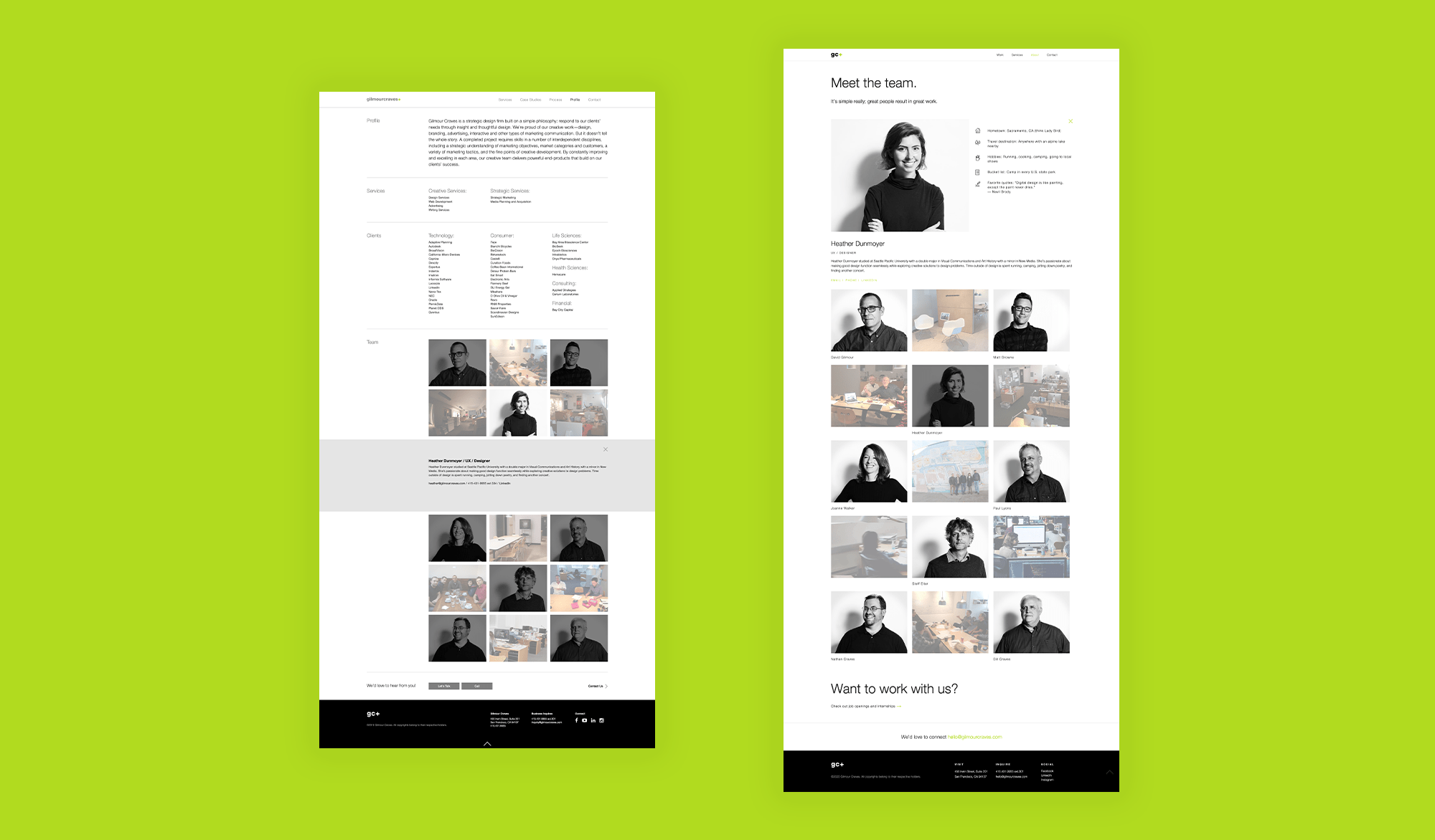
The previous site is on the left, while the new site is on the right
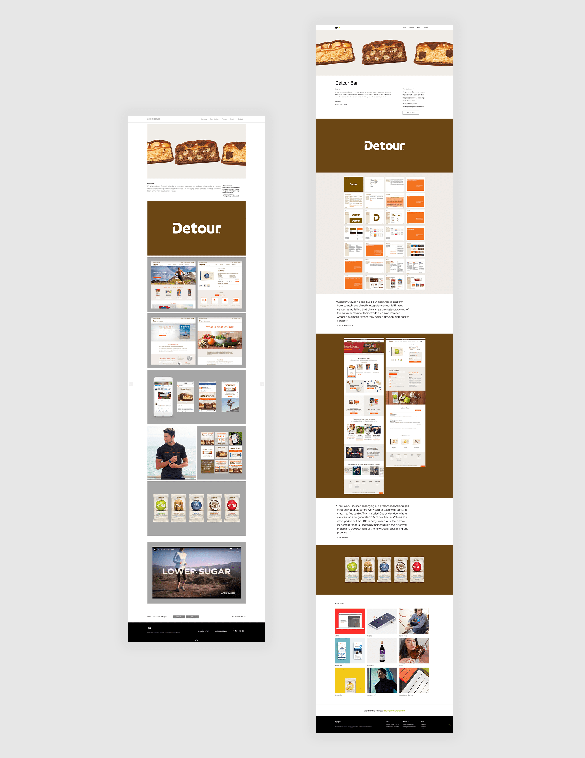
Another fun update to this site was reaching out to our clients to collect real quotes. It helps to paint a bigger picture of how the project was executed and give some insight into what it’s like to work with GC.
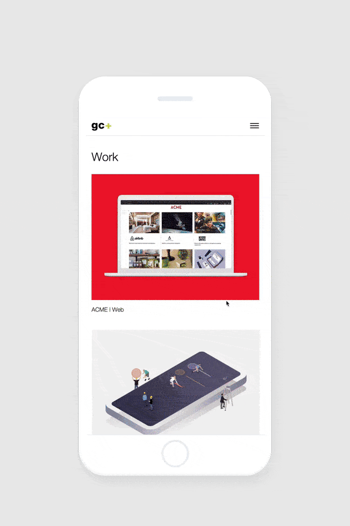
As always, we made sure to focus on the responsive version of the site as we wanted to be sure any user at any time could enjoy the experience of the GC website. We also wanted to keep the imagery engaging so that the more you scrolled the more eye-candy you could enjoy. Including a “view” more section at the bottom of each case study on the work page also encourages the user to dig a little deeper into what GC is all about.