

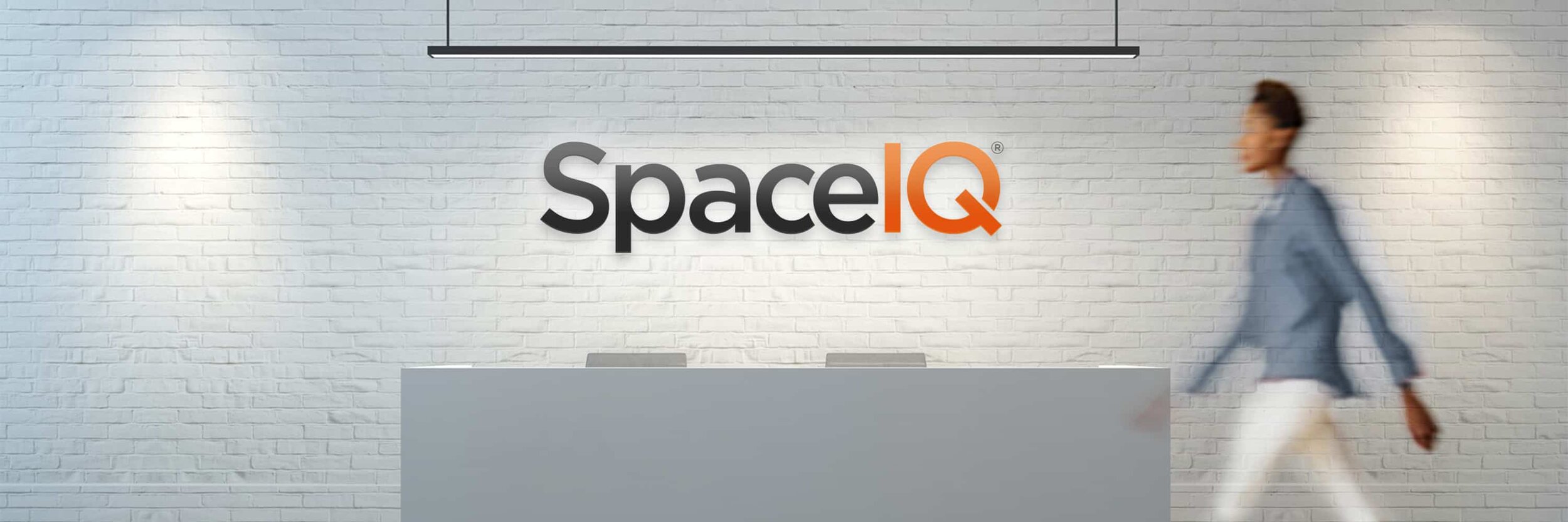
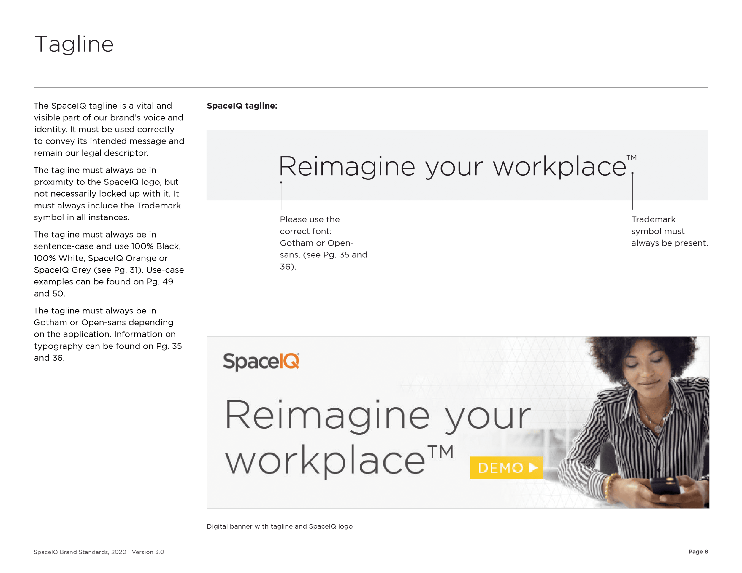
SpaceIQ
What
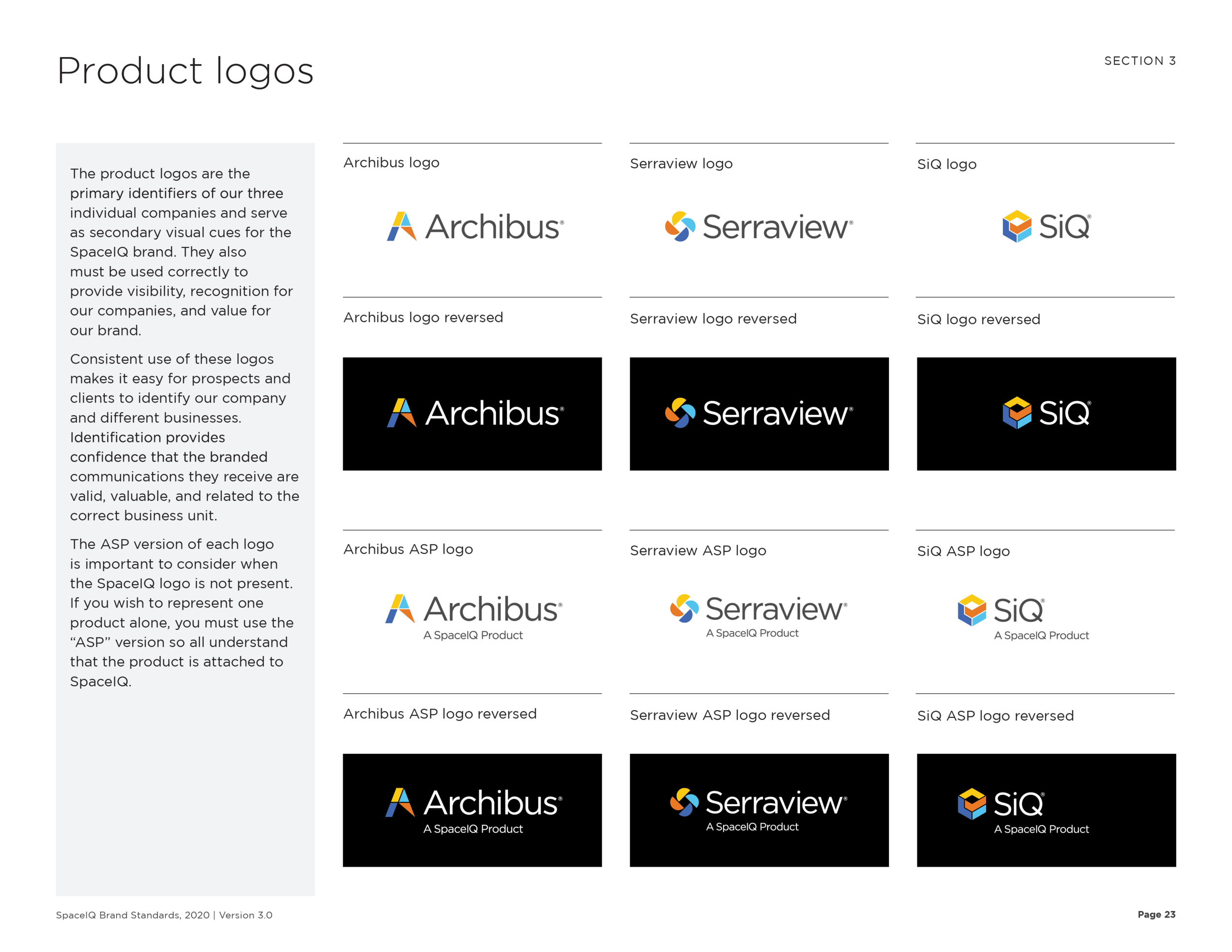
SpaceIQ was acquired by leading workplace management platforms, Archibus and Serraview in 2020. Since the name SpaceIQ was considered the strongest of the three companies, it was decided that the umbrella company would be “SpaceIQ” while Archibus, Serraview, and newly named; SiQ would be the three products. The goal was to merge and rebrand this new model.
Problem
The existing companies wanted to retain their customers and brand as much as possible, while still align all three products to be unified under one umbrella: SpaceIQ.
Process
Gilmour Craves worked with the three companies to conduct over thirty interviews with key players to best understand how to orchestrate the rebrand. It was apparent that there was not a desire for change but unification was necessary. In 2019, Archibus acquired Serraview so there was “acquisition exhaustion” and most just wanted to move forward as quickly as possible with the SpaceIQ addition, and not get bogged down with an entire rebrand. The core design elements of Archibus and Serraview were strong, but elements such as color, typography, and a branding system were not in existence. After capturing and carefully vetting the interview to address concerns and desires, it was time to crack down on the brand standards and set the new SpaceIQ brand into a gold standard.
Project Scope
Leadership interviews
Brand strategy and identity development
Brand standards and expressions
Templatized digital and print assets
Copywriting services
Motion graphics
Account management
Solution
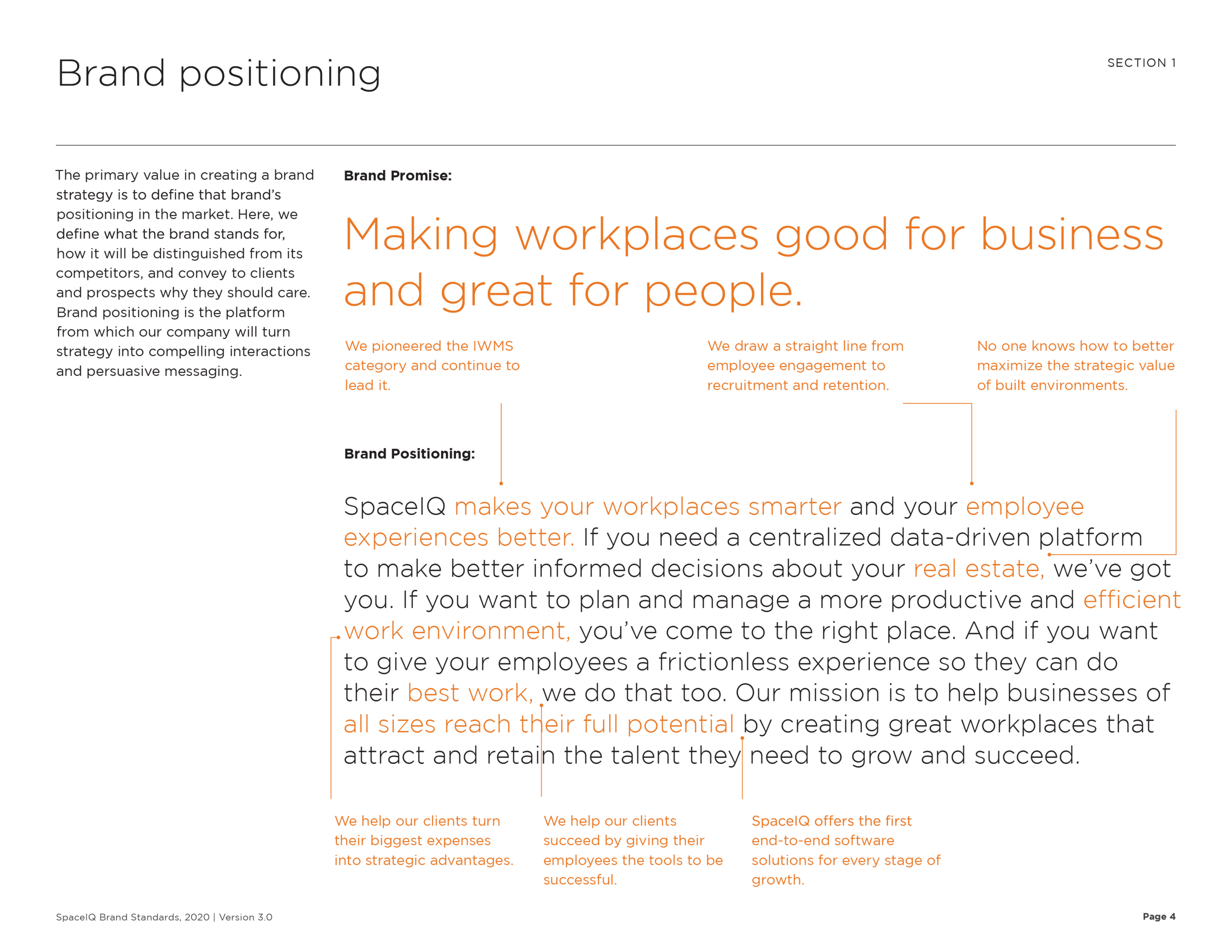
Once the interviews were conducted, important stakeholder meetings were held, and a strategy for how to move forward on the brand development was in place, Gilmour Craves provided two possibilities for a rebrand. 1. An overall departure into a new look and feel that could work as a system for the umbrella SpaceIQ and develop a system of new icons and colors for each product. OR 2. Retaining the same icons for Archibus, Serraview, and SiQ (formally SpaceIQ) but developing a new typeface, color system, and lockup for the umbrella; SpaceIQ. Ultimately, the second option was the solution. It provided a decent amount of brand recognition but still promised a relative system for how to organize products against the master brand. It also meant a more minimal rebrand approach that could be rolled out at a more leisurely pace rather than a complete overhaul. Lastly, it provided a structure that made sense to all parties involved and didn’t compromise the integrity like a complete rebrand might.


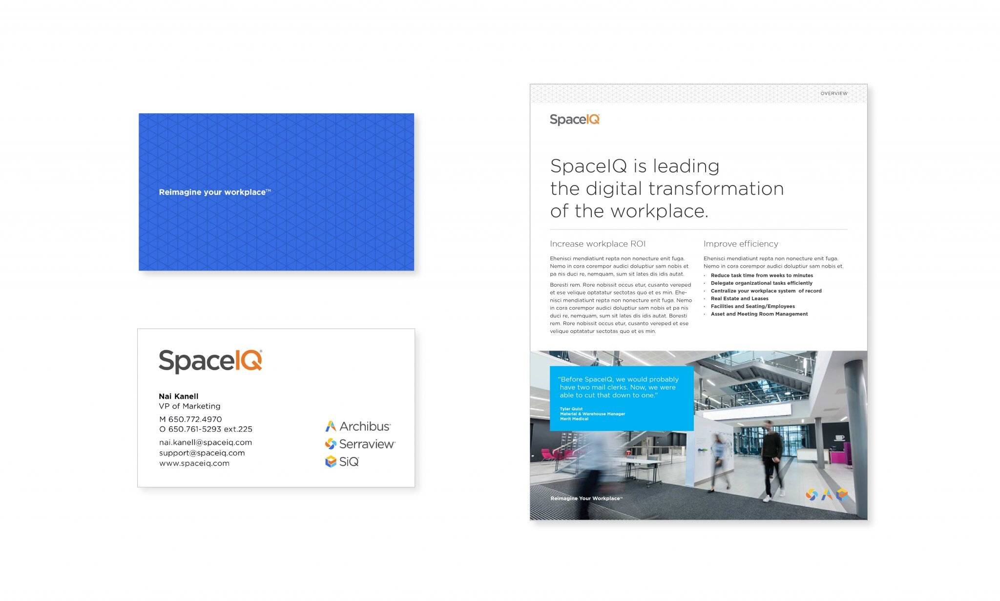

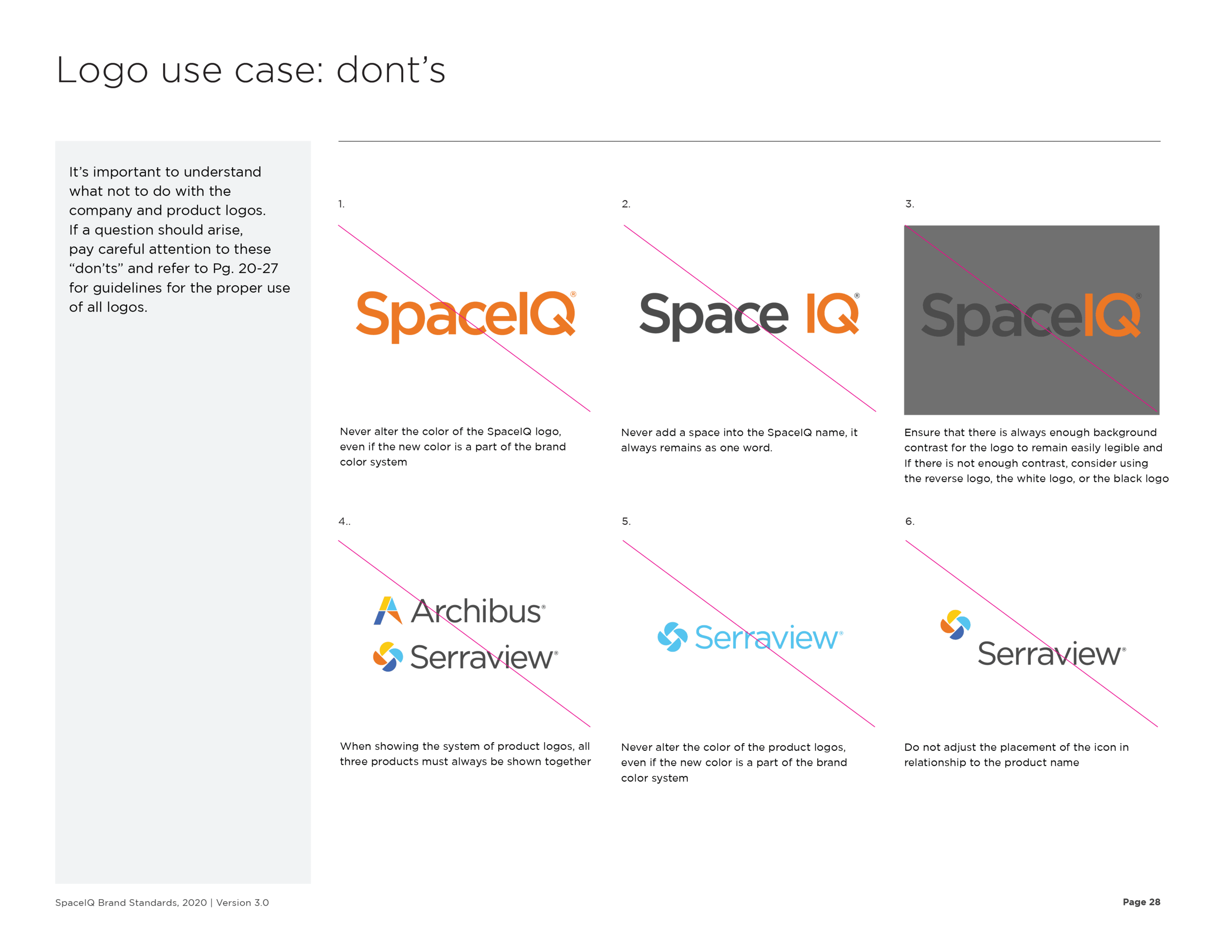

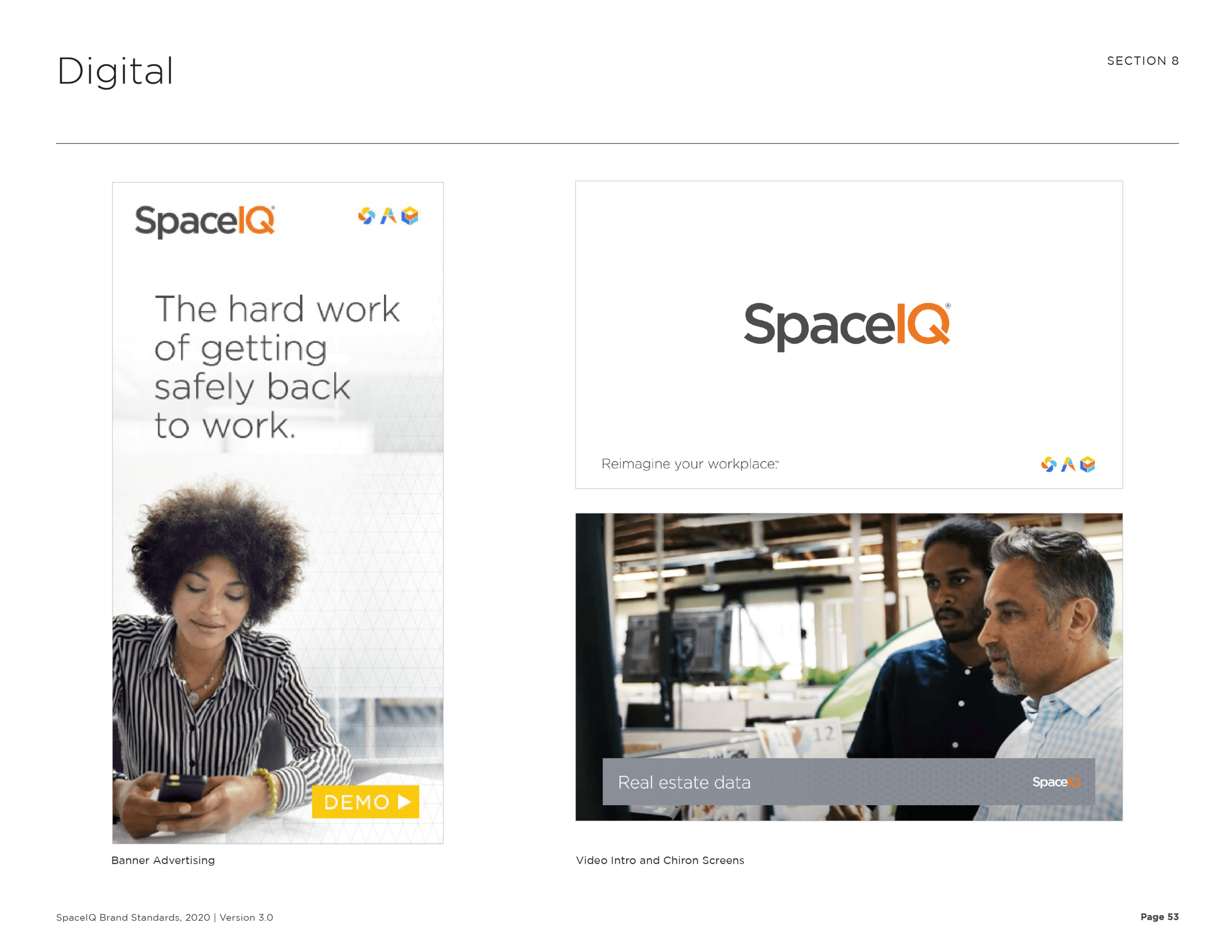

Gilmour Craves developed a 60+ Brand Guidelines document for SpaceIQ that outlined all aspects of their brand, their voice, and their marketing platform. Essentially any question you might have about the brand, the standards contained.
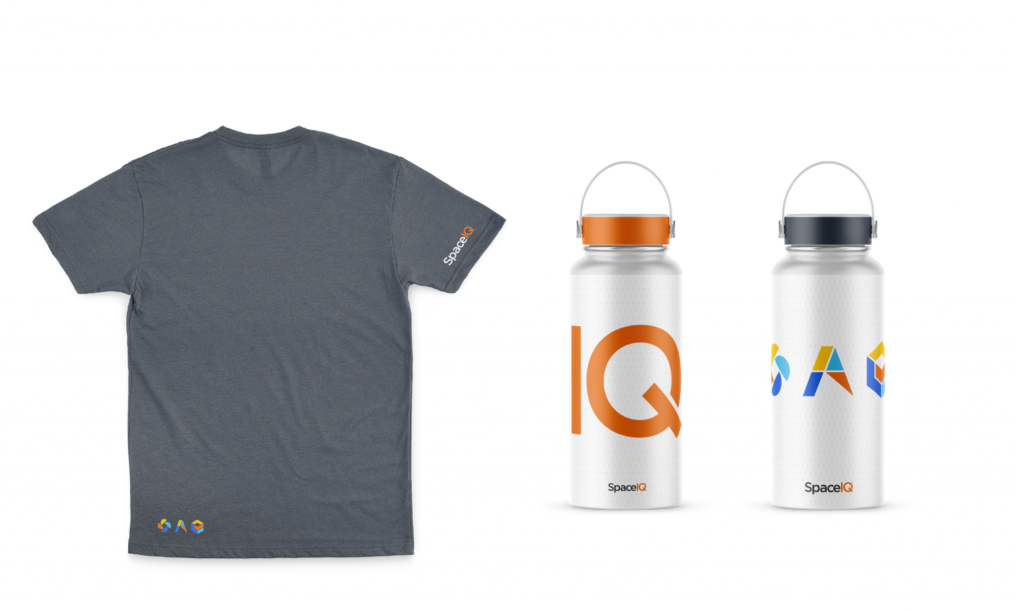
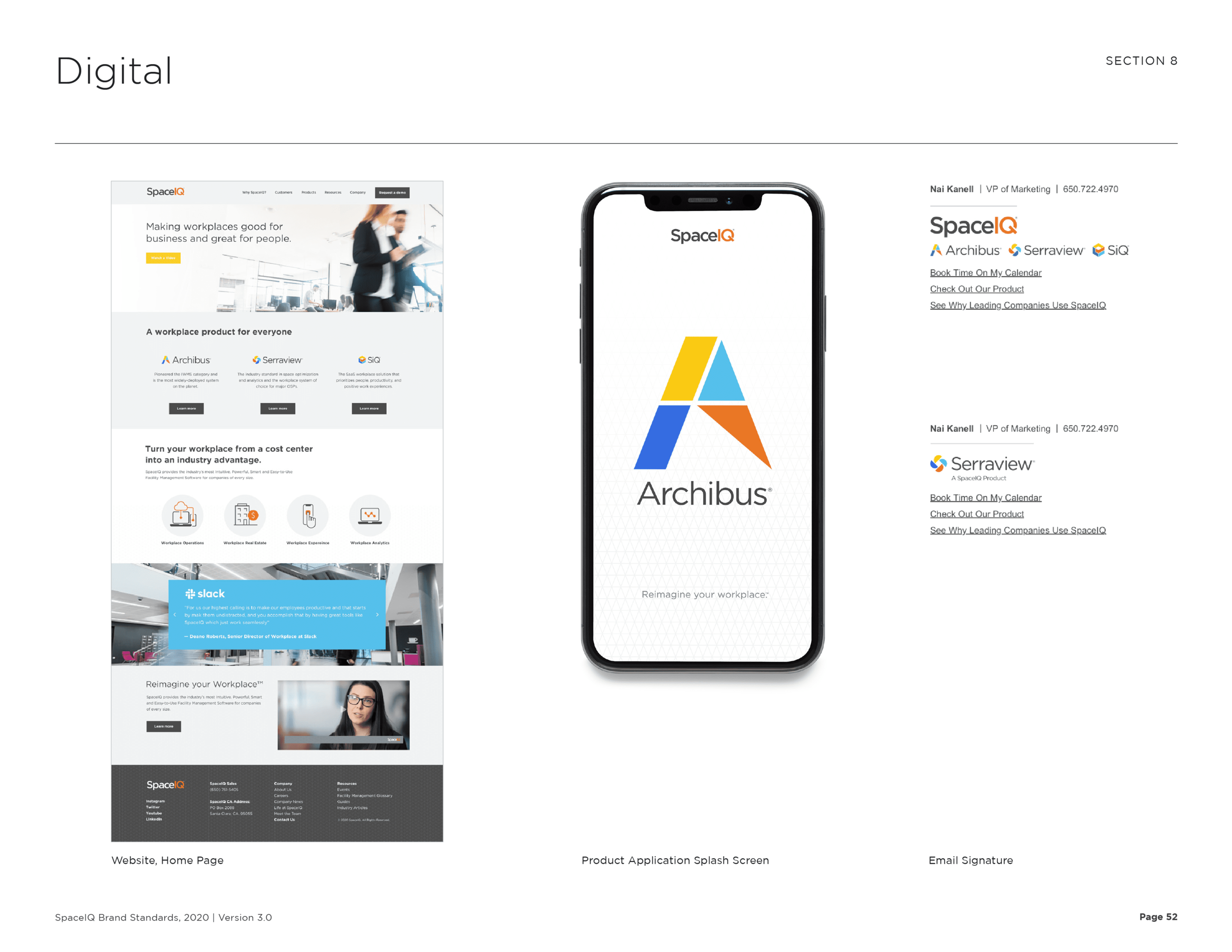
From brand color, to grid systems, typefaces, web banners, event swag, animation, print templates, email signatures, iconography, and photography—Gilmour Craves addressed it all.
The SpaceIQ team is well-equipped with a system that unifies three unique voices, as well as encourages the opportunity for expansion and growth over time. The goal was to build off of a working system, but do it in a way that felt cohesive and modern. The result is a stress-tested branding system that each team can utilize for years to come.